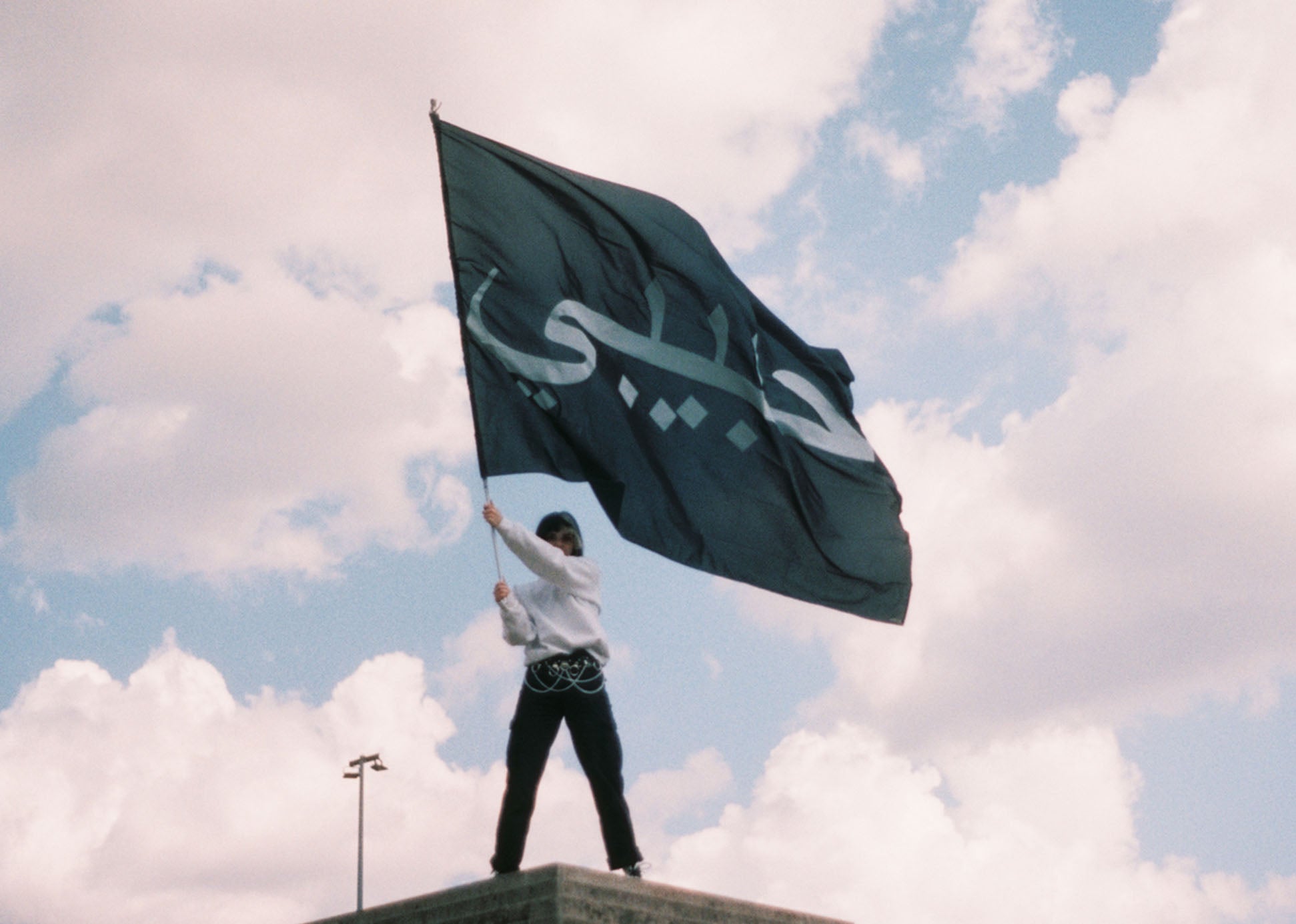


Some collaborations are limited to products. This one was bigger for us from the start. With Habibi x fritz-kola, we not only developed a collection of hoodies, t-shirts, and bags, but created a collaboration that went far beyond clothing. For us, this was not a classic product drop, but a project where fashion, design, attitude, and public interaction were intertwined.
For us, the core of this collaboration lay not only in the products but in the idea behind them. We have always been interested not only in the formal beauty of Arabic script but also in what happens when it appears in unfamiliar contexts. This is precisely what led to the work at the Hamburger Kunstverein: a 134-square-meter area where "Bratkartoffel" (fried potatoes) could be read in Arabic script—pronounced in German, but translated into a different visual system. This shift was central to us: to envision German terms visibly in Arabic script and thus change perception in public spaces.
We transferred this idea into the textile collaboration as well. For the collection, we set "fritz-kola" in Arabic script, working with the same tension on hoodies, t-shirts, and bags that underpinned the entire project: a well-known German brand, read through a different writing system. As a result, the products were not merely carriers of a logo but themselves part of the design statement.
Perhaps that was precisely what made this collaboration so special for us. We didn't just want to integrate Arabic script; we wanted to use it in a way that made familiar terms newly legible. Not abstract, not just aesthetically beautiful, but direct, humorous, and right in the middle of everyday life. A word suddenly became more than just language—it became a public moment, a moment of irritation, but also a form of closeness. For us, that's where the power of design lies.
The idea was further developed within the campaign, including terms such as "Franzbrötchen" (a type of German pastry) and "Pommes Schranke" (fries with ketchup and mayonnaise). The principle was also continued internationally with adapted terms. For us, it was important that this not only had a strong visual effect but also a clear stance: not to treat Arabic script as an alien element, but as a natural part of the present, humor, urban landscape, and pop culture.
The collaboration also included a five-day pop-up, which we conceived and designed as its own space. For this, we developed a kiosk-style space, used refrigerators for product presentation, and created a place where the collaboration could not only be shown but experienced—with DJs, catering, movie nights, and performances. We also conceived and carried out the photoshoot ourselves. The products were designed and produced by us and sold out. Thus, the collaboration resulted not just in a collection, but in a complete project with a clear design signature.
The fact that the campaign went viral, a reel with the "Bratkartoffel" motif reached over two million views, and the project was awarded silver at the German Digital Award, further highlighted the impact of this work. For us, however, this was never just a question of reach or awards. What was decisive was that an idea, which arose from our perspective on typography, culture, and design, reached so many people and triggered a genuine reaction.
When we look back at Habibi x fritz-kola today, we don't just see a collaboration, but a project that encapsulates much of what Habibi stands for: typography as attitude, design as intervention, humor as an icebreaker, and space as part of the message. For us, it was a moment when an idea became a visible cultural gesture.